Personal Project
Music Player — Web Development
Using the Spotify API for Developers, the goal was to create a functional music player app, implementing quick API retrievals and up-to-date UI/UX design trends.

Industry
Media
Created
2024
To develop a dynamic and engaging music player web application that leverages the Spotify API, allowing users to seamlessly play their favorite tracks and discover new music tailored to their tastes. This project aims to combine music streaming with modern UI/UX trends, creating an intuitive, visually appealing interface that enhances user interaction and promotes effortless music exploration. By integrating trending design elements, the application offers an immersive experience that aligns with current aesthetics while maximizing functionality and ease of use.
I successfully created a user-friendly platform where users can easily access and explore a wide variety of music using the Spotify API. The app’s responsive design and integration of trending UI/UX elements is visually appealing layout, intuitive navigation, and interactive features.

React
JavaScript library for creating interactive user interfaces efficiently


Tools Used
Javascript, HTML, CSS
Coding Languages Used
With vast music options available, users often struggle to find an intuitive, visually engaging platform that simplifies music playback and discovery. This project aims to address that gap by developing a streamlined, modern music player app that utilizes the Spotify API to offer a seamless, personalized, and aesthetic music experience.
User Activity: Approximately 44% of Spotify's monthly active users engage with the platform daily, making it a consistent part of their routine. On average, users spend about 25 hours per month listening to music on Spotify (Tone Island)
Playlist Engagement: A significant portion of Spotify listening occurs through curated playlists. Roughly one-third of Spotify’s total listening time is dedicated to these playlists, showing their role in helping users discover new music (Kommandotech)
Device Distribution: Mobile devices account for around 52% of listening time, highlighting the platform's popularity among on-the-go users. Meanwhile, the web player and desktop apps make up the remaining share. (Kommandotech)
With a large portion of users listening on mobile devices, the application needs to be responsive to particularly mobile screens.
Since one-third of Spotify listening time is spent on curated playlists, users need efficient ways to discover new music tailored to their preferences.
The web player should offer a smooth, responsive, and visually engaging experience to the millions of users.


Eisen Hover Matrix
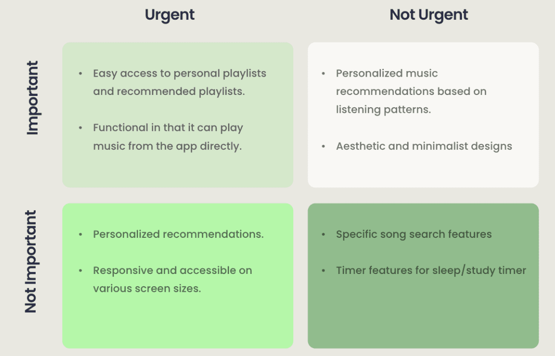

I sketched low fidelity wireframes in order to think of the layouts that would best display the information I wanted to convey to the user, as well as thinking of different important components I would need to add, such as the navigation bar, card components, and different animations I want to add.
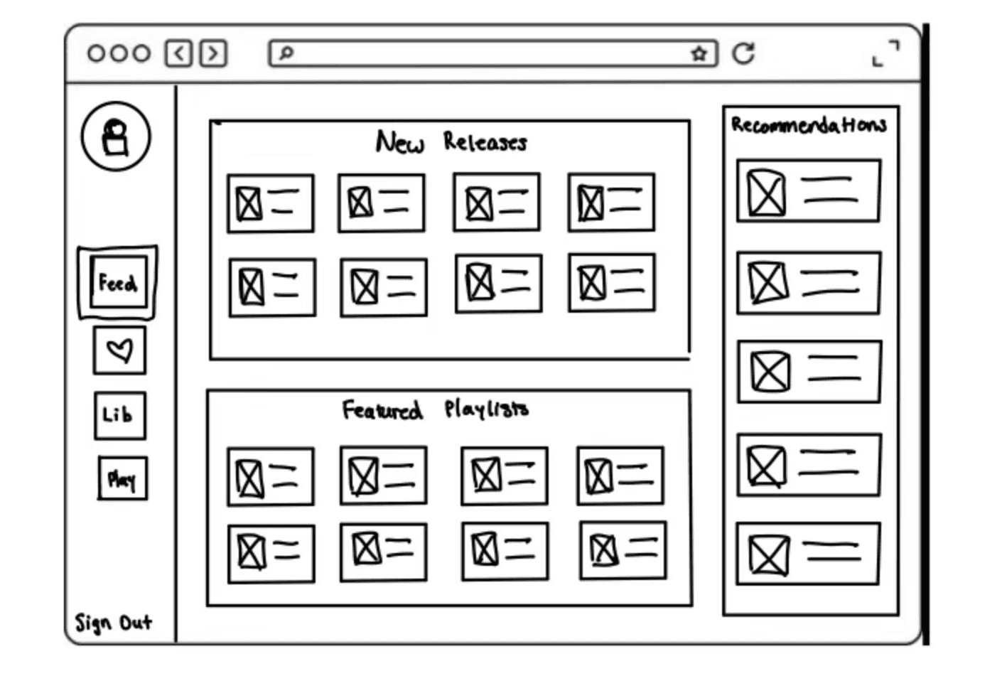
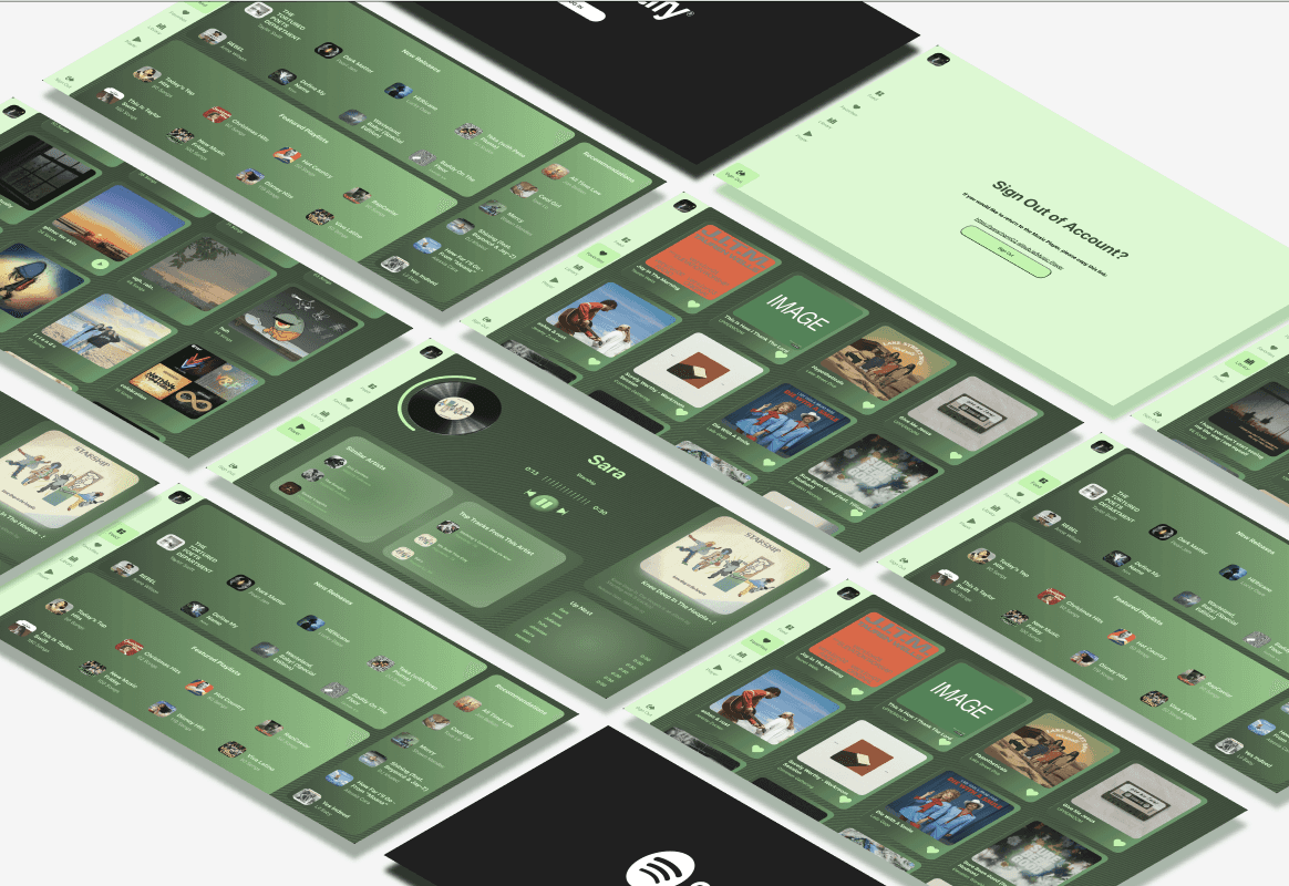
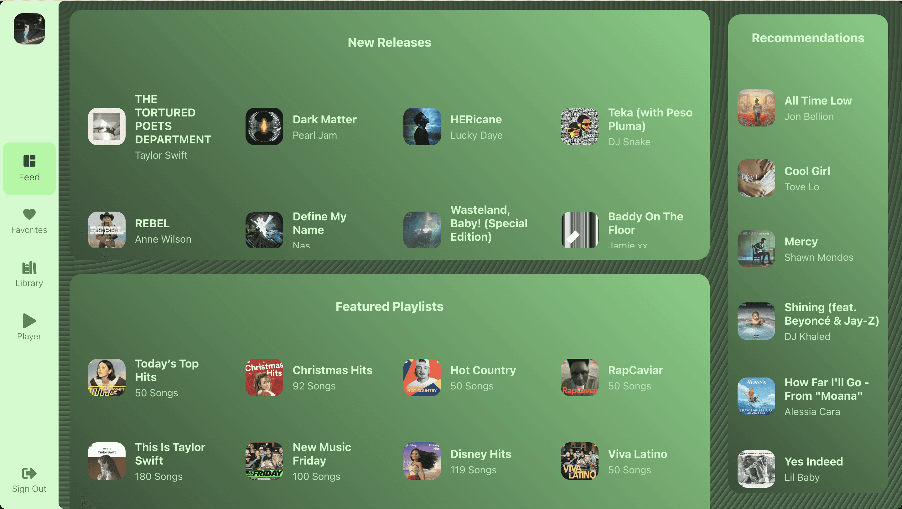
Feed / Home Page
Separate the screen into 3 sections with a flex layout and organize the personal recommendations / suggestions.
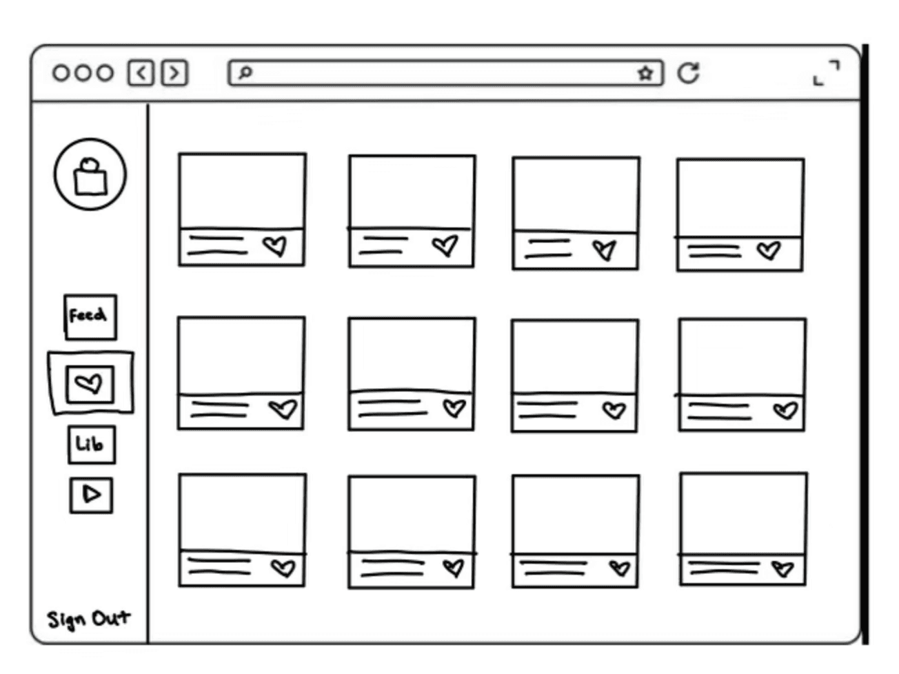
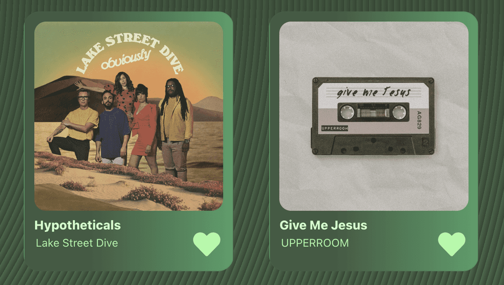
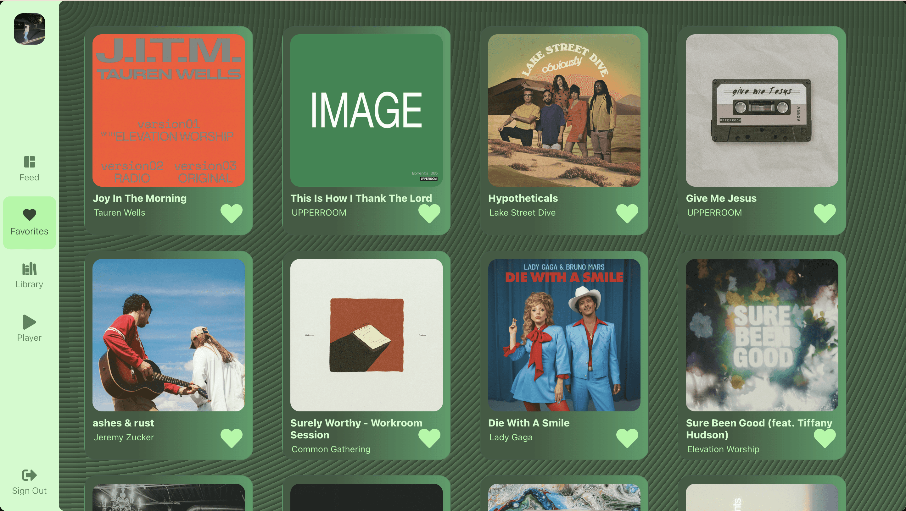
Favorites Page
A card for each song that can display the info for each song that the user plays the most.
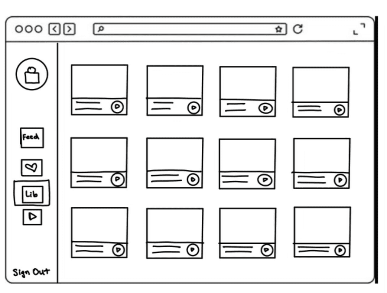
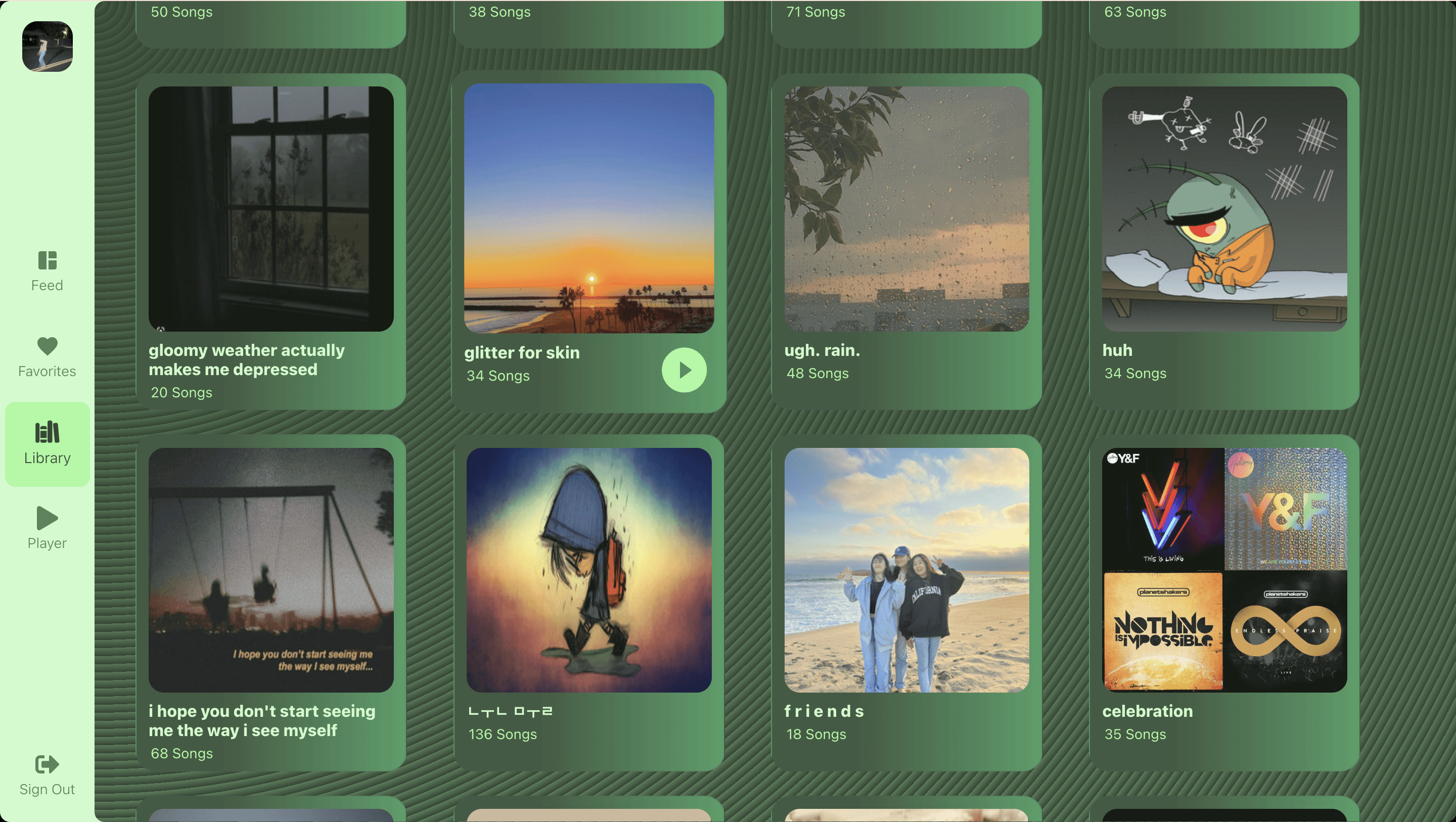
Library Page
Similarly to the Favorites Page, using the playlist cover, create a card for each playlist that displays the number of songs.
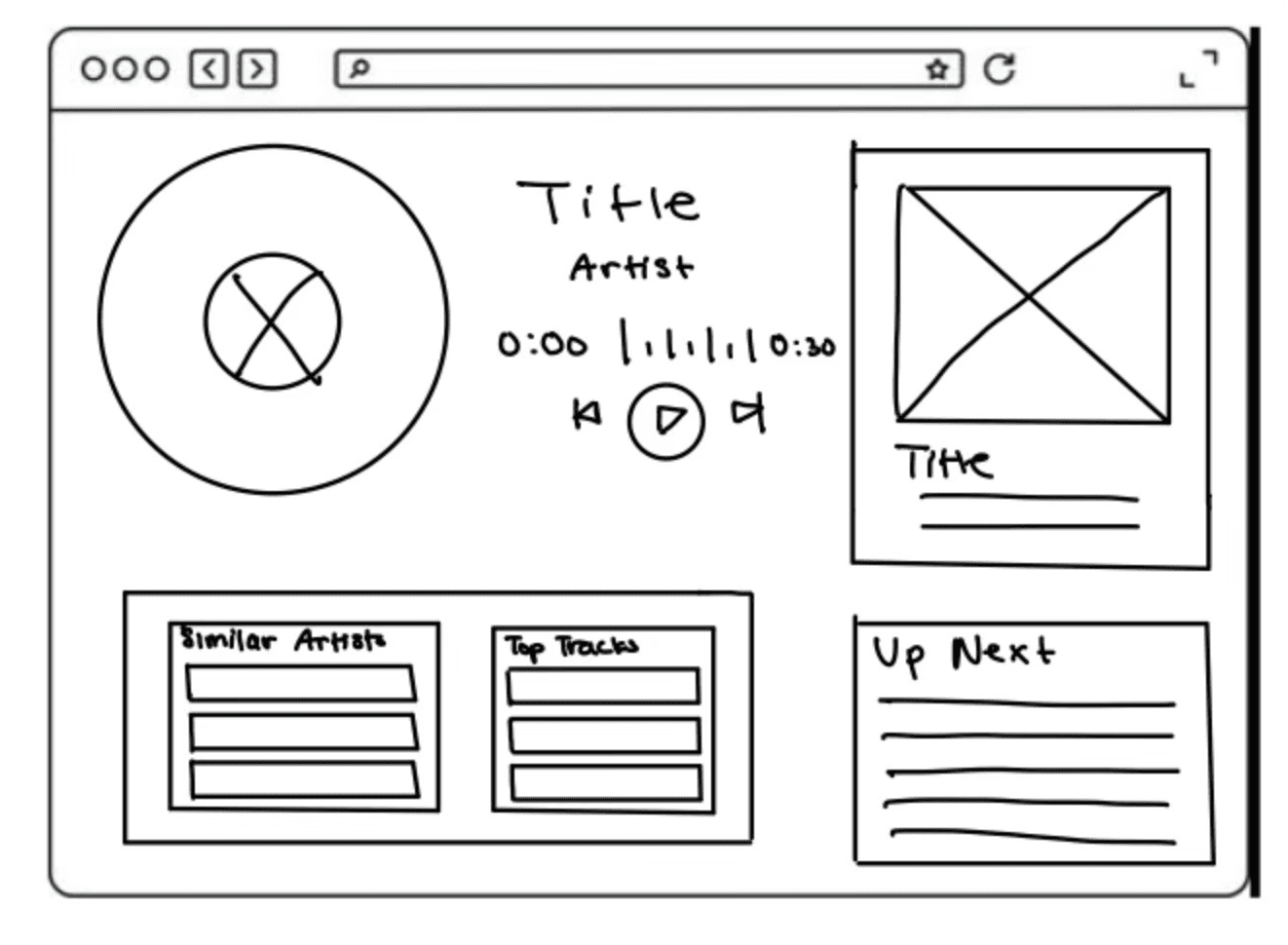
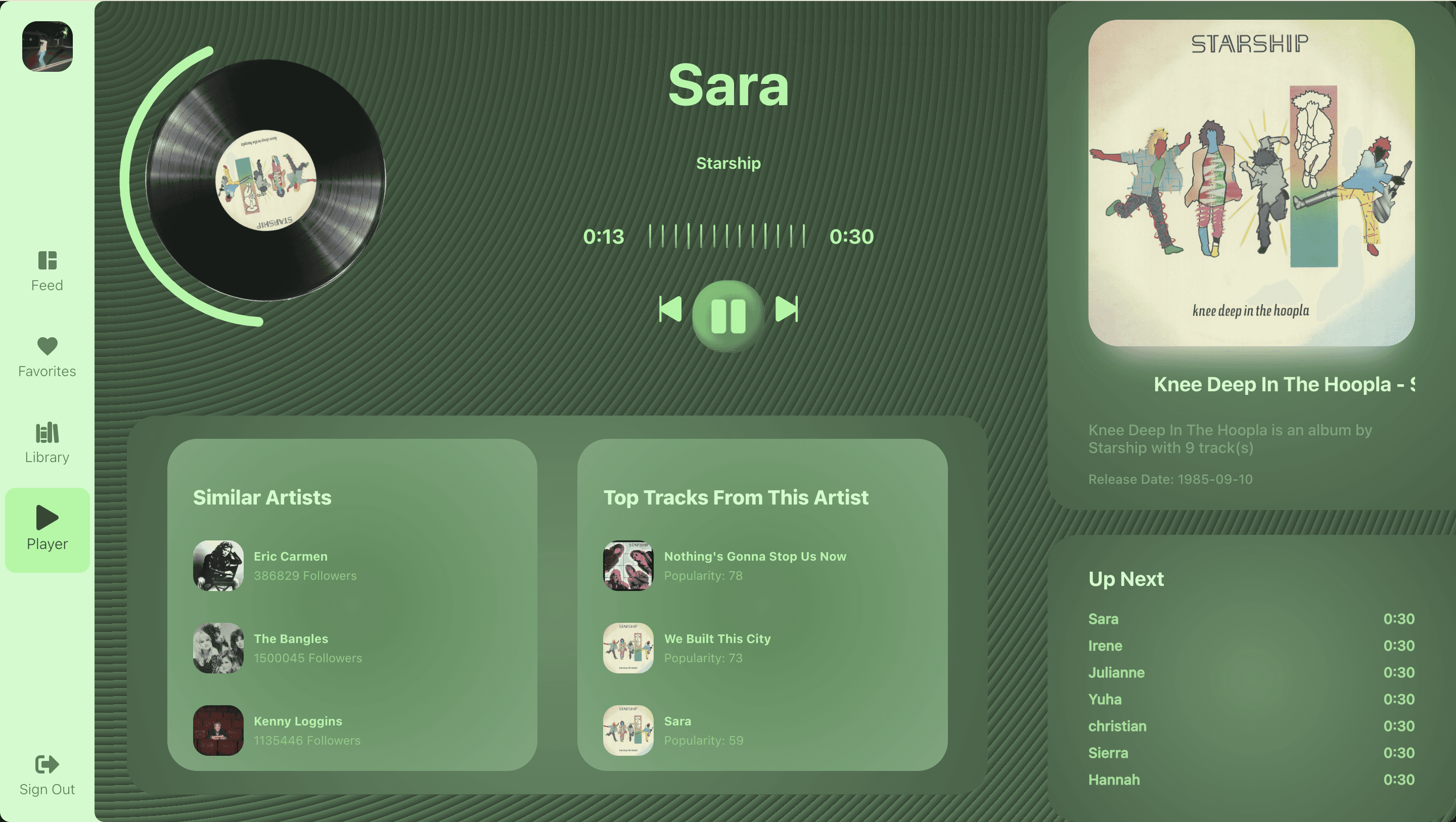
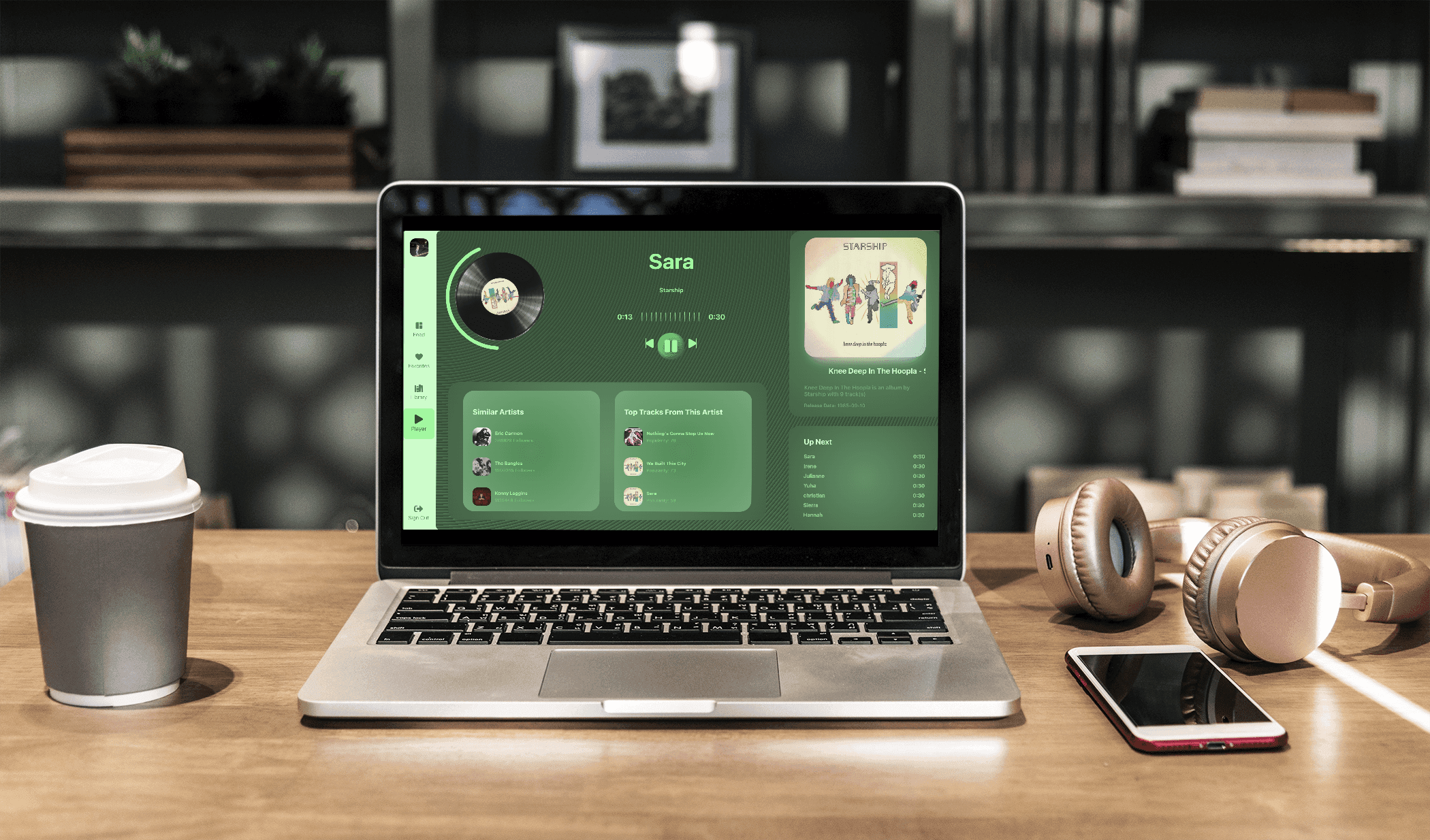
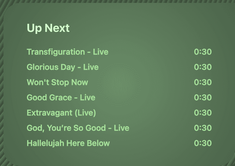
Player Page
Display the information of the song that is playing and have a Queue as well as similar artists and other recommendations.
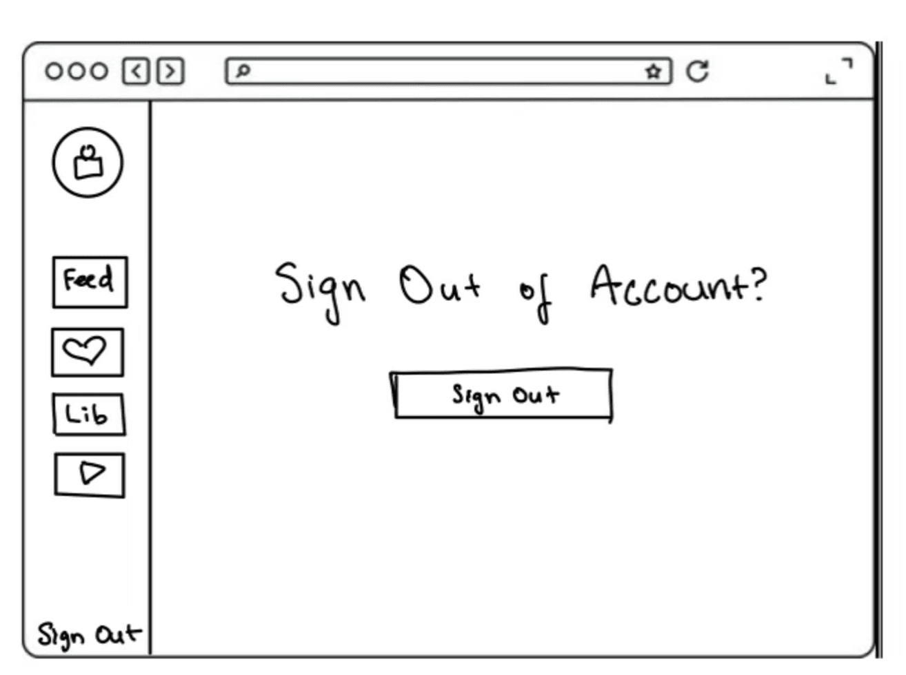
Sign Out Page
Create a Sign Out page with a quick button so that the user can access other accounts or log out with ease.
Design trend that uses semi-transparent, frosted-glass-like elements to create a sense of depth and layering in UI
I decided to use glassmorphism on major images of the songs in order to emphasize the image itself in a subtle way that separates it from other parts
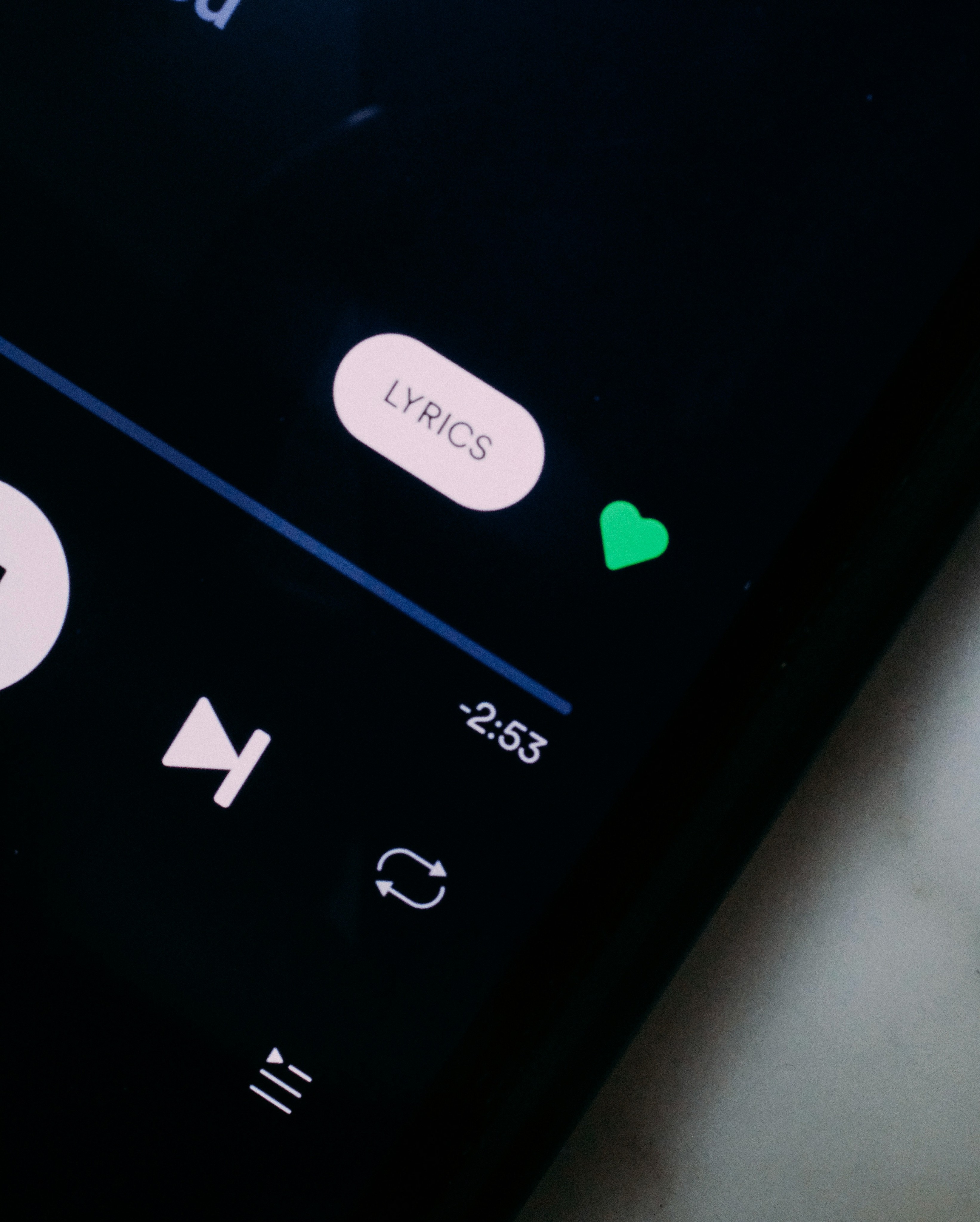
Small, animated interactions that provide feedback to users when they engage with elements
I decided to incorporate microanimations for parts of the screen that the user could interact with to make the experience more engaging and intuitive. I also added microanimations for the play button, skip buttons, and queued songs.
Design style that combines flat design with soft, 3D effects to create a tactile, “extruded” look.
I wanted to combine light and dark colors in a radial gradient to bring the shadows to the edges, and color the text to complement the shadow effects to make the text "pop out" within a flat surface.
The most important part of the development was to connect my application to the Spotify API. The API allows developers to retrieve lots of data from Spotify's database and allows for direct connections to its streamline service.
Backend Connection
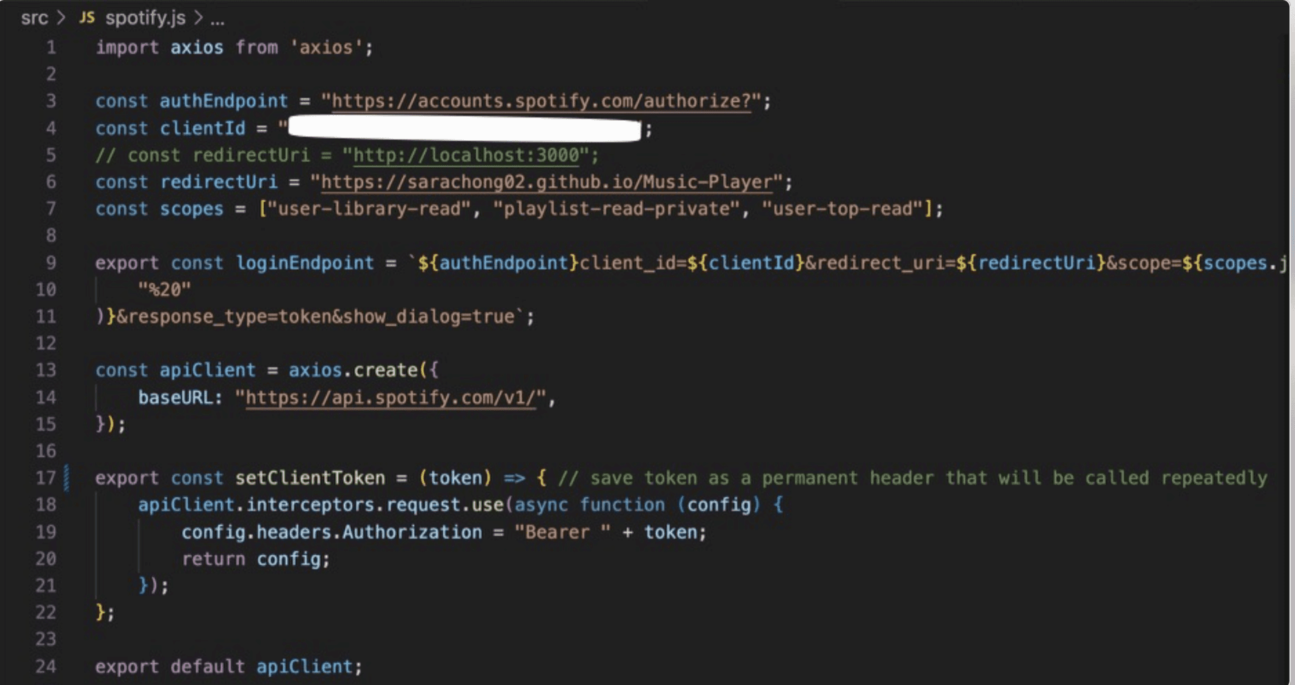
In order to access the wonders of the Spotify API, I needed to first import Axios to handle HTTP requests. I then needed to establish the authorization endpoints and client information (clientId) in order to handle authentication that would be needed to retrieve personal preferences and recommendations from the user. Once authorized, the redirectUri allows the user to be redirected to the Music Player webpage. The 'apiClient' variable creates an Axios endpoint with a base url and sets it to the endpoint to the API. Lastly, the setClientToken function configures apiClient to automatically include the user’s token in every request header.
API Connection Pt. 1
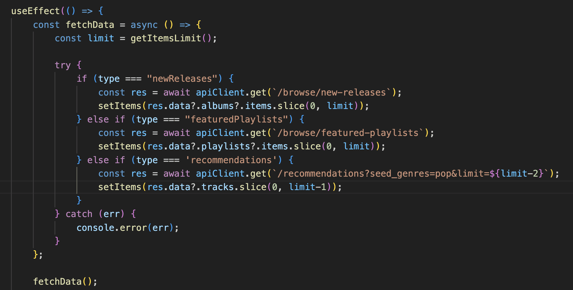
This code is from PlaylistContainer.js, which calls from the API and displays the items into a container and is later called in the Feed page. Specifically, this fetchData function in the useEffect hook uses a try-catch format to potentially catch any errors, and uses an if statement that checks the "type" to determine the which endpoint to use. Depending on the "type", the apiClient.get method fetches the specified endpoint, accesses a certain number of information from the endpoint, and lastly, sets the component's state with the fetched items using setItems(). To trigger the async function, I call fetchData() within the useEffect.
API Connection Pt. 2
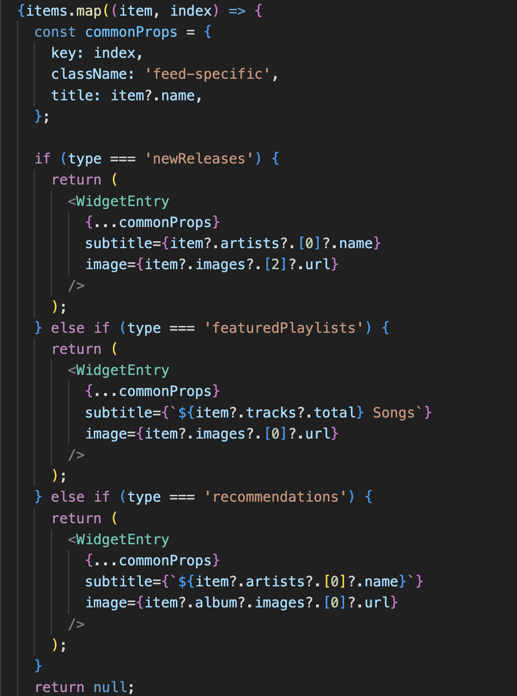
Within the number of items that is called in PlaylistContainer.js, I also need to call the information of each item. I do that (for the Feed Page) in FeedCard.js, which is similar in style to the other places I retrieve such information. Using the map() function, I iterate through each item and return a <WidgetEntry /> component depending on the item's type. The commonProps object holds the properties that are common to all the <WidgetEntry /> components to write cleaner code. Using the if statements, I check for the object's "type", and depending on that type, I either render the name or number of songs, as well as the image of the respective playlist or song. This style of code is similar for other pages such as the Favorites, Library, and Player pages.
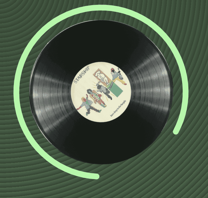
Rotation Animation
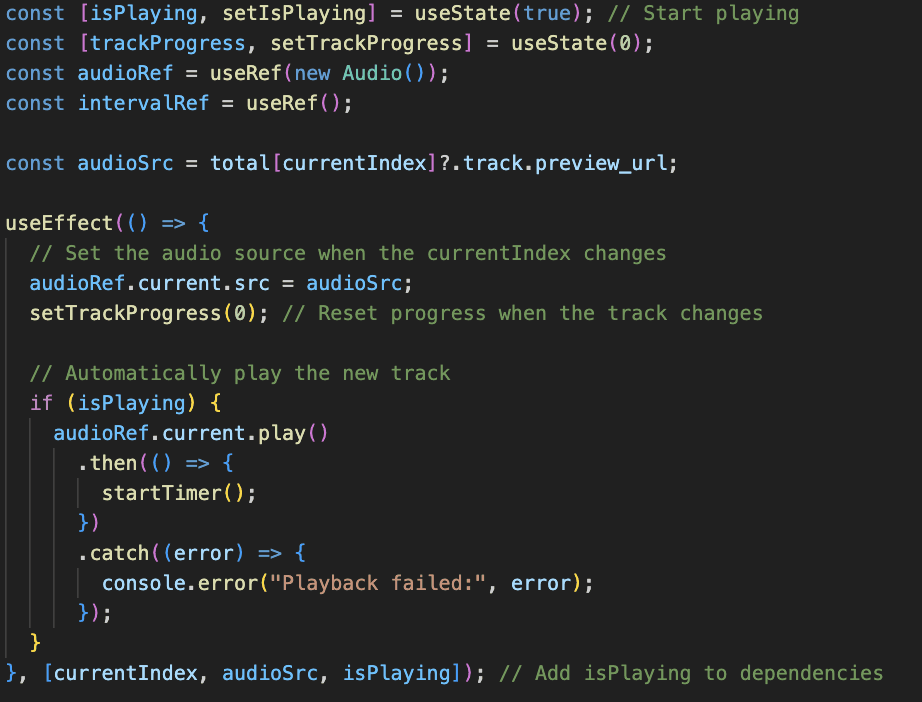
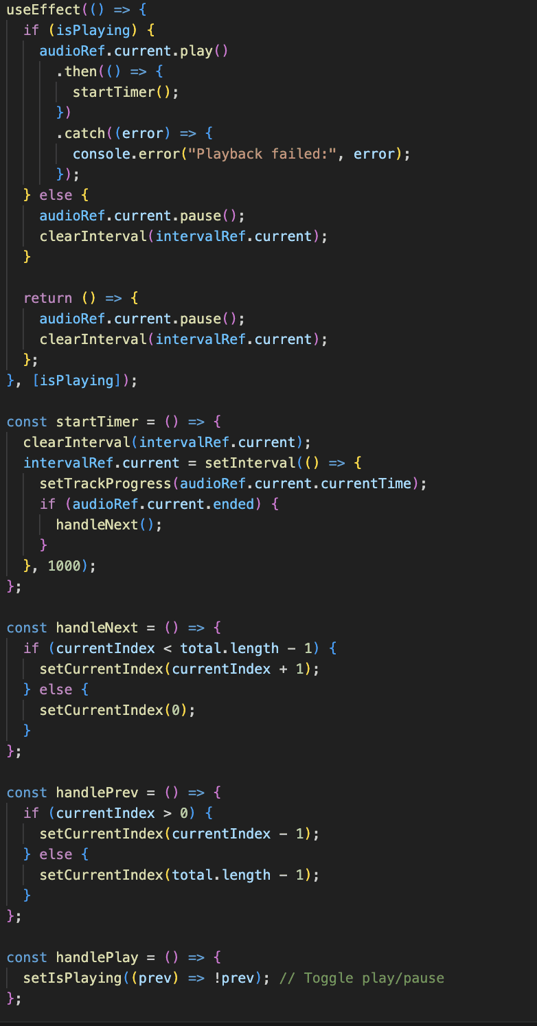
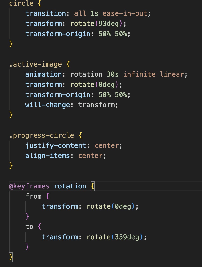
When the webpage is on the Player page, an image of a record player with the image of the album cover in the center, rotates with a timed progress circle as the song is playing. Using CSS, I first designed the main circle class to rotate by 93 degrees (transform: rotate(93deg);) and sets the origin of this rotation to the center (50% of the width and height) (transform-origin: 50% 50%;). If the track is playing, I have the .active-image CSS property that applies the rotation keyframe animation to the .active-image class. The rotation completes in 30 seconds and loops infinitely with a steady (linear) speed (animation: rotation 30s infinite linear;). The @keyframes rotation sets up a smooth continuous rotation from the start to near-completion of a circle (from { transform: rotate(0deg); } and to { transform: rotate(359deg); }).
Wave Animation
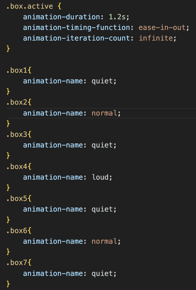
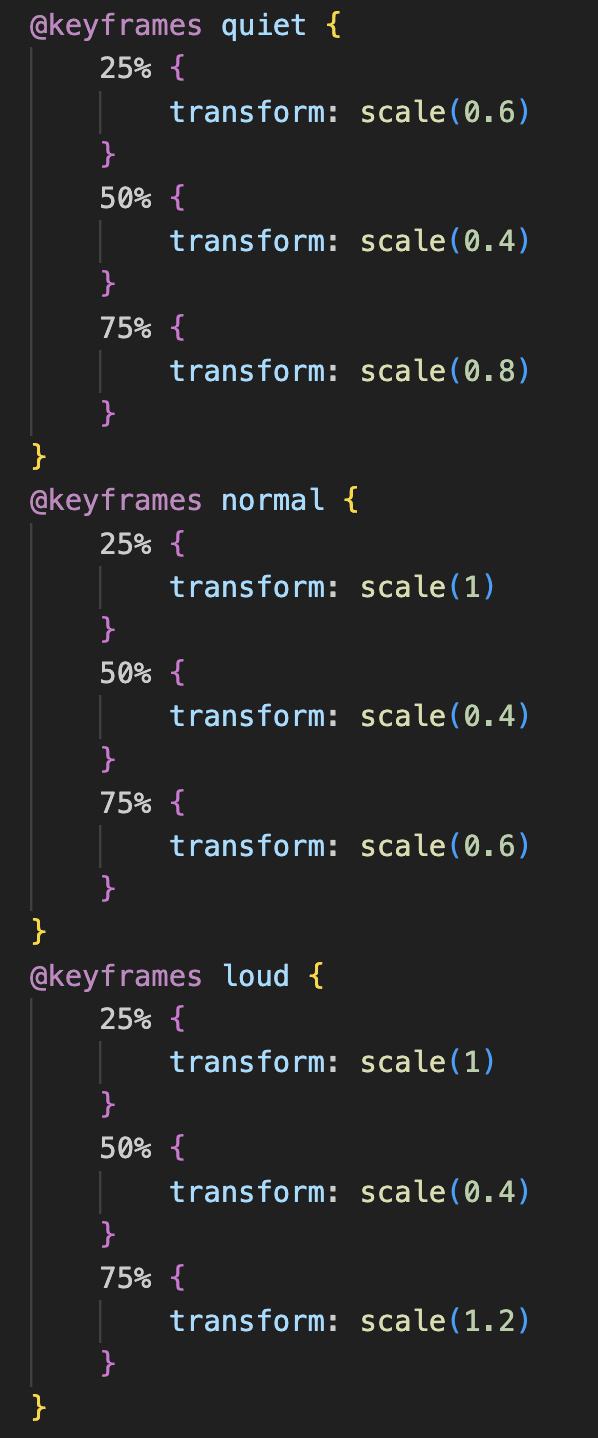
There are two major parts to the wave animation that moves when a song is playing. First, when the box that holds the smaller wave parts is active (.box.active), the code sets up an infinite animation loop with a 1.2-second cycle time, using ease-in-out timing for smooth transitions. Then, each individual box is assigned an animation-name, specifying one of three keyframe animations (quiet, normal, or loud). The second half of the CSS code creates keyframes for scaling effects. "quiet" animates the box to grow to 0.6 scale, shrink back to 0.4, and then grow to 0.8 scale, "normal" scales between 1, 0.4, and 0.6, giving a moderate visual effect, and "loud" scales between 1, 0.4, and 1.2, creating a more pronounced visual effect. The resulting CSS creates a dynamic, animated visual effect, with each box scaling differently to produce an equalizer-like movement.
Responsiveness
Making the Website Responsive
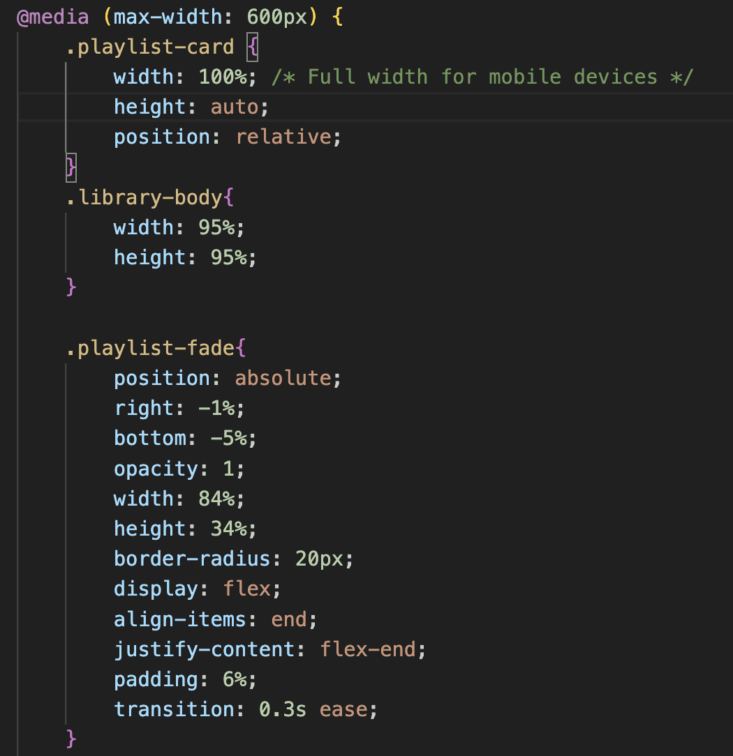
This is an example of how I make the Library page, which holds the playlist cards as well as a play button that appears when hovered. To ensure a responsive and optimized layout for smaller screens, in this specific part of the code, I use a media query that targets devices with a maximum screen width of 600px. For the playlist-card, I make sure that the width and height are adjusted to the new screen size, and I use position: relative; to keep the element within the normal document flow. For the .playlist-fade (which is the classname for the play button that uses a hover effect), I change the opacity to 1 because there is not hover effect that is possible on mobile devices. I also change the "right" and "bottom" properties to ensure that the button is positioned exactly where I want it to be. Overall, for all of the screen sizes, I decided to keep the Sidebar on the side, taking up about 5% of the screen space, as I want this website to maintain easy navigation to other pages.

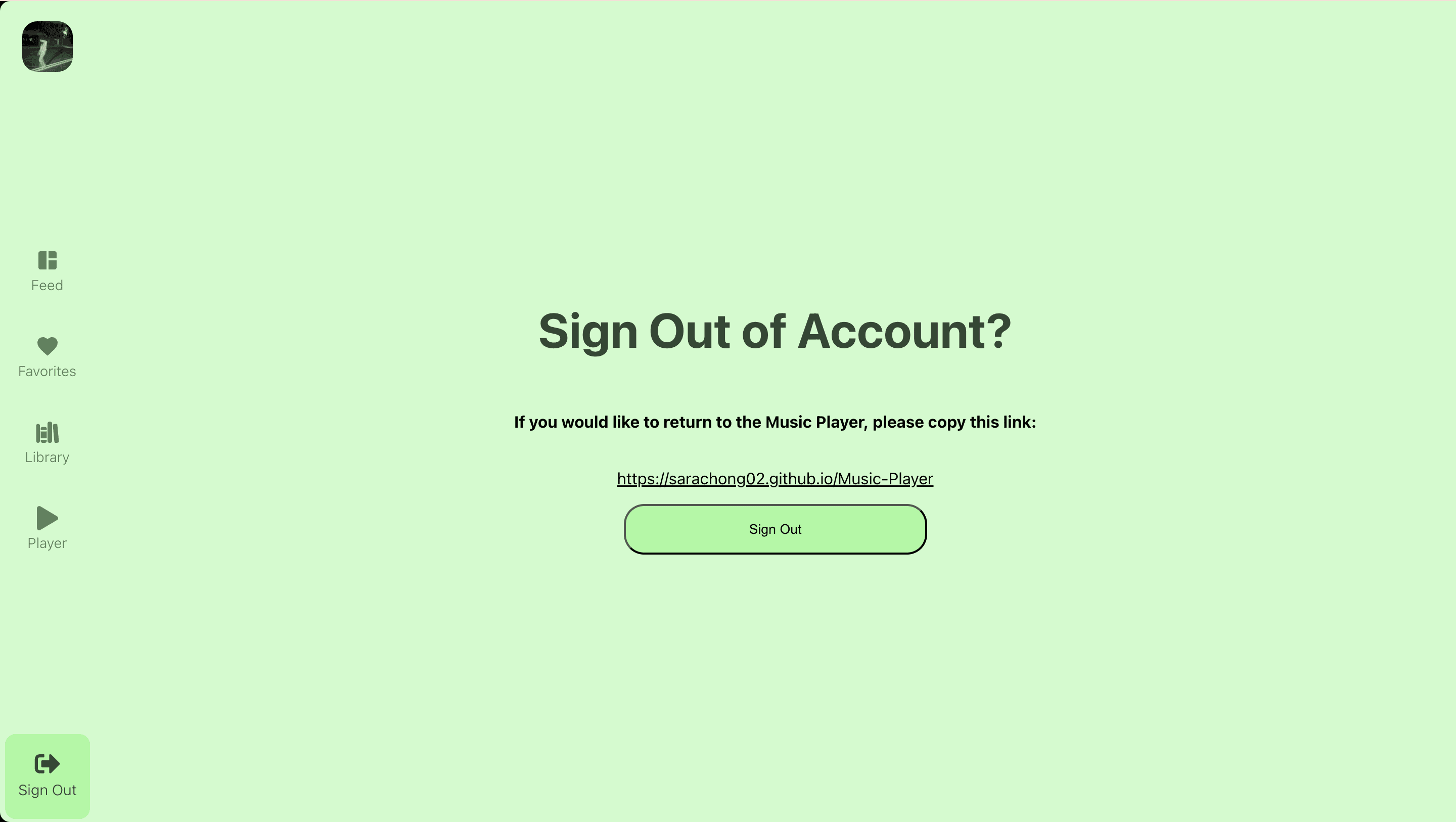
Sign Out Page
Feed Page
Favorites Page
Library Page
Player Page