
GIS UX Design
GIS Interface UX/UI Redesign

Geographic Interface Evolution: Redesigning for Clarity
Problem: Boundary RSS's GIS tool should allow users to upload shapefiles and generate a 1 km radius preview analysis before placing an order for a full spatial analysis. However, the existing interface presents significant challenges: an unclear workflow, unintuitive interactions, and limited feature discoverability.
Solution: Redesigned the GIS interface to help users seamlessly upload data, configure modifications, and interpret outputs without confusion.
My Role
End-to-end Product Design
User Research
Design System
Component Development
Team
Cross-functional team of 1 designer, 1 frontend engineer, 1 backend engineer, 2 geographical experts, 1 product manager.
Tools
Figma
Miro
ChatGPT
Results Preview
Increase in expected total sales from GIS Interface
Usability testers who expressed a positive experience
Approval from Stakeholders for Phase 2
Company background
About the company
Boundary Remote Sensing Systems (Boundary RSS) is a B2B SaaS startup company that strives to empower subsurface exploration through an end-to-end geographic information system (GIS) software platform.
The company’s goal is to “make exploration faster, more accurate, and scalable than ever before.”
Project overview
The Previous Interface
*Note: I do not have access to images of the previous interface.
There were many challenges with the previous interface. Some of these include:
Images coming soon..!
Uintuitive, Low-Fidelity Interface:
Visually outdated interface
Slow internal file directory
No Interaction/Personalization Points
Static map outputs
No tools for navigation, analysis or personalization
No preview or interaction with the output before order processing -> long wait times and repeated iterations
Images coming soon…!
Images coming soon..!
Limited Feature Discoverability
Hidden/unclear tools and action points
Lots of jargon
Research Methodologies
Data Collection Strategies
I appreciated the rare notes within the code. Because the code it self was MESSY.
Heuristic Analysis
User Interviews
Usability Testing
User Interviews
3 User Interviews to identify core user needs and opportunity areas.
Current Customer
Subsurface System Expert
Backend Engineer
Formative Usability Testing
3 sessions with current/new users to uncover usability breakdowns.
Heuristic Analysis
4+ heuristic analyses using established GIS principles and UX standards to identify usability issues.
Research Insights
From the 3 research methodologies, I consolidated some key research insights.
Users have difficulty moving from data input to accessing spatial analysis outputs to placing an order.
Dense features, numerous files, and technical jargon create high cognitive load.
Multiple layers, filters, and advanced tools overwhelm users, especially first-timers
New Users Rely on Trial and Error; Minimal Guidance or Onboarding
No guidance for any modification or view capabilities (no tooltips, labels, etc)
UI is visually outdated and clunky, affecting the perception of reliability
User Personas
Name
James Rodriguez
Age
38
Austin, USA
Lead Researcher at an Environmental Monitoring Agency
Role description
Specializes in environmental monitoring and climate research, leveraging GIS tools and data visualization software to analyze large-scale geographic patterns. Translates complex geospatial data into actionable insights for climate change mitigation.
Goals
Conduct large-scale environmental monitoring and 3D mapping using real-time data.
Integrate Wi-Fi-based mapping with existing satellite imagery for ecosystem studies.
Generate visual reports for policymakers and researchers based on processed data.

Needs
A seamless interface to configure and launch 3D geospatial surveys quickly.
A robust API that allows integration with existing GIS tools like QGIS and ArcGIS.
High-resolution rendering with minimal processing delays.
Clear, interactive documentation for the platform’s functionalities.
Pain points
Difficulty in integrating different data sources into a cohesive visualization model.
Limited real-time environmental monitoring due to gaps in satellite imaging.
Challenges in scaling high-resolution mapping from local to global datasets.
Complex UI in existing geospatial tools, making it difficult to set up customized surveys.
IDeation
Design Requirements
With the research insights, I outlined 4 design requirements:
Streamline the Data-to-Output Workflow
Create a clear, guided path from shapefile upload to spatial analysis output to final order submission, reducing confusion and task friction
Reduce Cognitive Load with Clear Language and Organization
Replace technical jargon, declutter dense features, and structure layers, filters, and tools in a way that minimizes overwhelm for first-time users
Improve Learnability Through Guided Interactions
Introduce onboarding, tooltips, labels, and in-context guidance to support users who currently rely on trial-and-error
Modernize the Interface with a Unified Design System
Establish consistent visual styles, components, and interaction patterns to improve usability and reinforce reliability
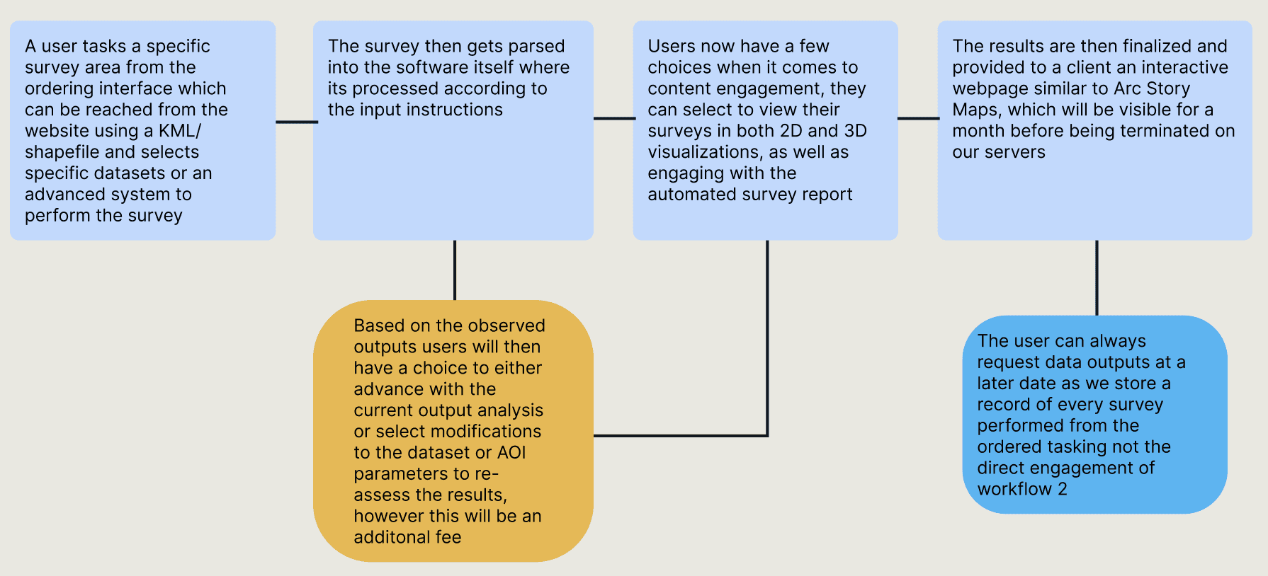
Main User Flow
I followed a similar user flow to the previous interface, which was provided to me.
Product design
Research…again
As this was my first experience with GIS interface design, I started by researching key components of GIS UX trends.
I combed through different articles and compiled a list of different GIS UX principles, many which were missing from the previous interface.
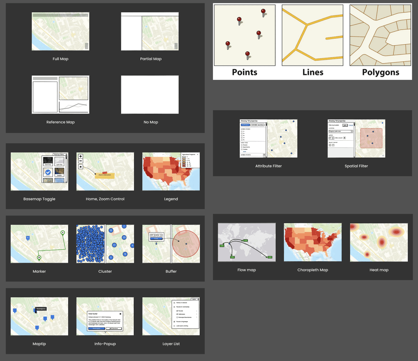
Grid of foundational GIS components
Sketching to Understand
I was still in the process of understanding how GIS interfaces were used, but regardless of how much I understood, I had to start sketching.

Two sketch ideas (out of 10 different sketches)
In the initial sketches, I prioritized minimizing the number of screens and steps, so I kept all parts of the process — from uploading data to exporting data — in one screen.
Mid Fidelity Wireframes
From the sketches, I decided to separate the uploading data flow and the main use flow so that the left sidebar could be completely dedicated to layer management.
Visual hierarchy is very important in GIS interfaces, and I attempted to break down the user flow even further into separate screens to reduce cognitive load for users.

Screenshot of mid-fidelity wireframes
Prototyping
Prototypes & Design Rationale
The last half of the project was dedicated to coding the designs to life using PyQt.

Easy navigation for methods of uploading data and feedback to what is already uploaded. Intuitive workflow start.

Easy alternative option for those who only have access with a link. No need for download, reduces steps.
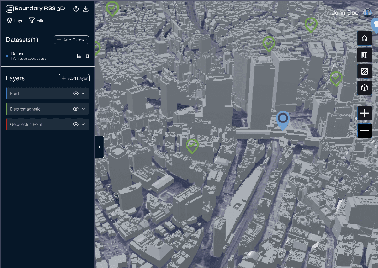
Collapse button that allows users to hide the left panel, allowing for full access of space. Reduces cognitive load when viewing output.

Adhering to GIS UX standards.: Give the user control of the spatial map output and its visibility using Zoom capabilities.
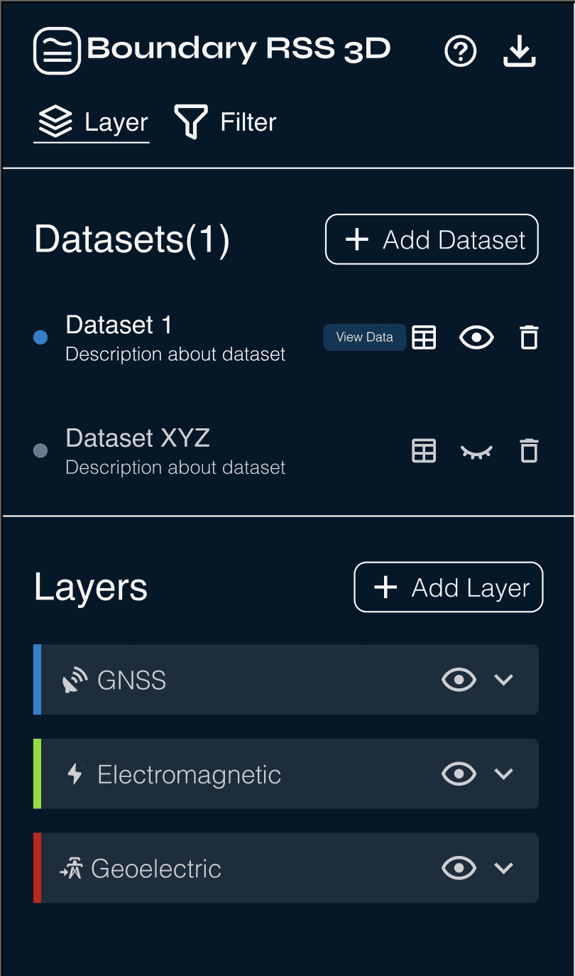
Visual Hierarchy: Grouped every functionality to reduce cognitive load, organizing by section to guide navigation through each step.
PINK: Learnability: Help button for users for assistance
BLUE: Feature discoverability: Added tooltips for every button.
YELLOW: Personalization: Gave users more control by creating simple buttons that adjust the visual output they see.
Visual hierarchy: prioritized most important pieces of information at the top and the least important at the bottom.
PINK: Feedback States: Gave user cues to how the system is responding to each action.
YELLOW: Expandable sections to show/hide sections to assist with cognitive load.
BLUE: Feature discoverability: added Icons with labels to assist with learnability.


Navigation: Legend to help with navigating different icons in the map output.
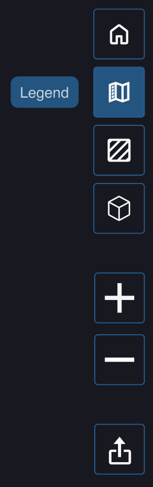
Feature Discoverability: Tooltips to help with navigation
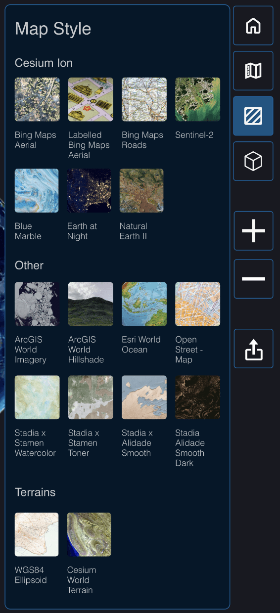
Direct Manipulation: Each directly adjustable option from the right menu panel appears right next to the menu to allow immediate actions without extra navigation.
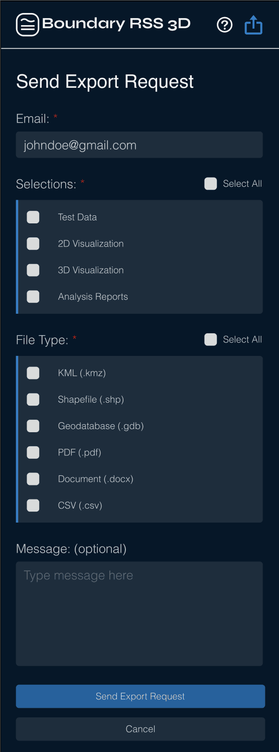
YELLOW: Clarity: Gave clear instructions for needed information to reduce confusion
PINK: Bulk Selection: Simplified the selection process for users
GREEN: Export Request hides the sidebar to decrease cognitive load, and place full attention on export process
Design System
Because the company had no established design system, I created a foundational system that reduced design to development time by 25% and established a unified design.
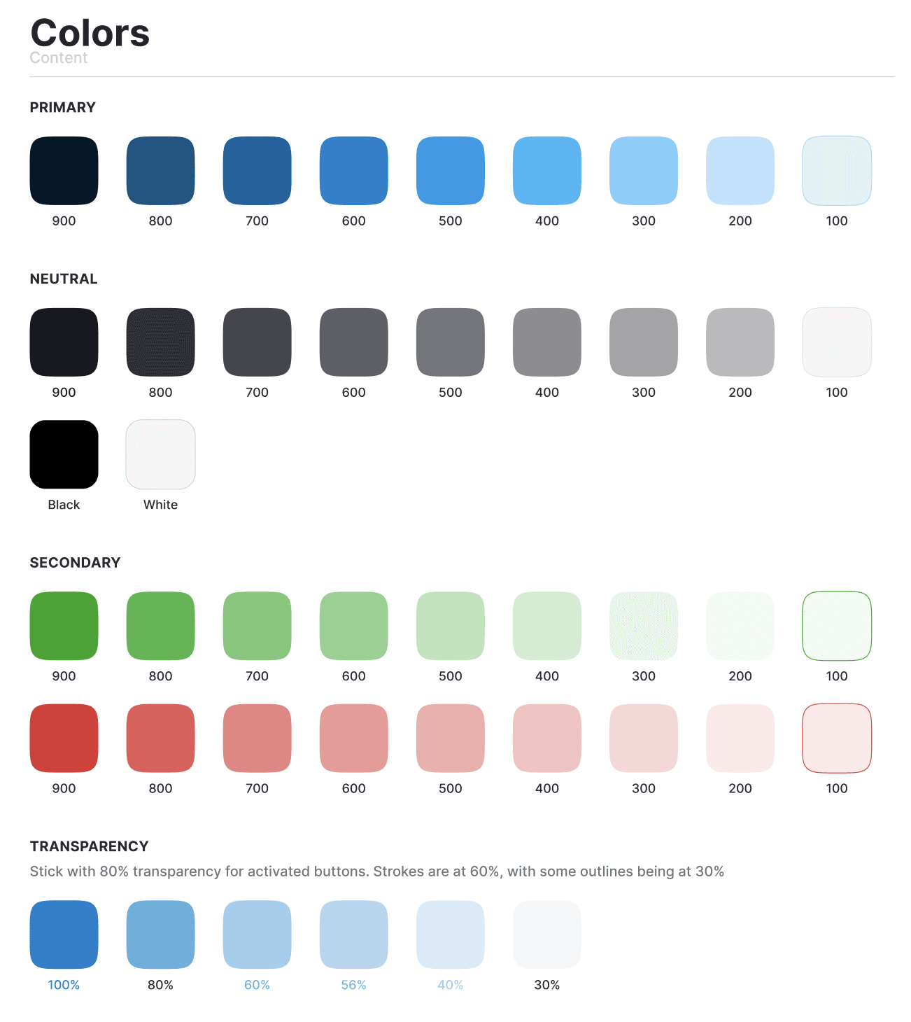
Color Palette
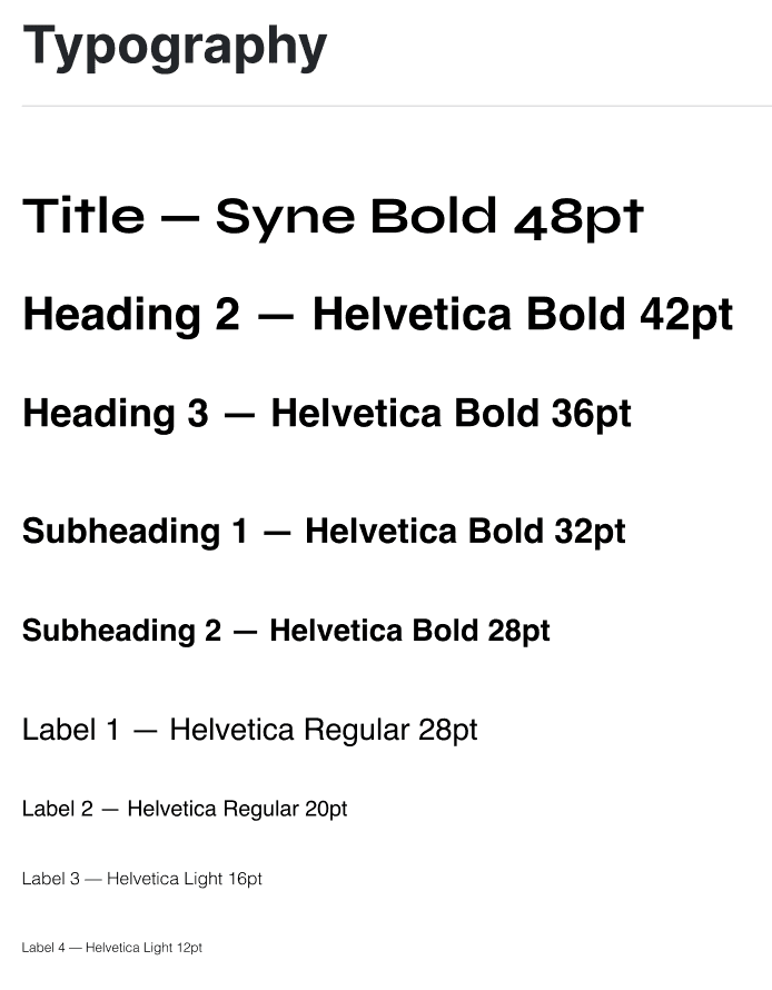
Typography
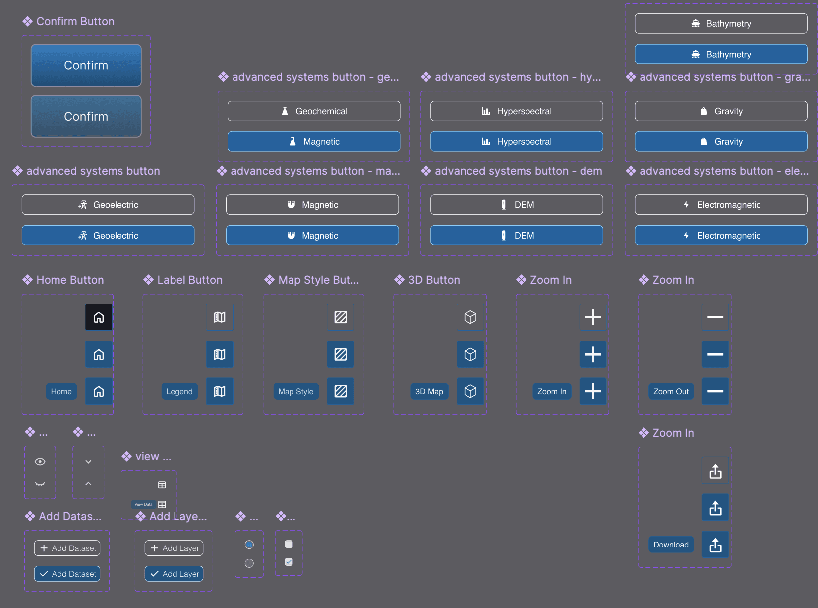
Component Library
Challenges
Major Challenges
15 minutes to prove my worth. So much pressure. But in preparation for my presentation, I was able to see how my final product was able to accomplish my goal to allow FSMs to run their own simulations at the CLICK of a button.
Challenge 1: Learning while designing
First experience with GIS design. First exposure to subsurface imaging concepts.
How I Overcame: Using my resources
Heavily researched scientific articles about subsurface analysis. Used AI to summarize and read through PRDs so that I could understand what I was even designing
Challenge 2: Solo Design in low UX maturity environment
Company doesn’t have a mature UX environment → disregarded UX research, expected high-fidelity prototypes in 3-7 day time periods
How I Overcame: Using my resources
Weekly design sprints with CEO, engineers, and developers.
Created a “UX dictionary” with terms that other team members could references (e.g. “prototype” vs “low fidelity wireframe”)
the impact
wWW (What Went Well)
Even with the challenges, Phase 1 had some great successes!
Increase in expected total sales from GIS Interface
Usability testers who expressed a positive experience
Approval from Stakeholders for Phase 2
Some personal wins:
New Design Niche:
Learning a new niche of UX research & design → potential interest for future career goals
Science + 3D Design:
Lots of new experience with scientific UX design concepts and 3D design.
Next Steps for Phase 2
There is an exciting future for the Boundary RSS, with several new design ideas for the interface to be added!
AI Analysis Feature
Accessibility Check
More Usability Testing
In-app Purchasing
Flagging System
Profile Page
Onboarding Walkthrough
Filter Features
Help Page
Animations
After evaluating my design choices, I also see room for improvement in:
GIS Accessibility Guidelines
More Whitespace
The left sidebar is still quite condensed, which may affect navigation speed and cognitive load
Clearer end-to-end workflow
Currently the software is designed so that a request is sent to download spatial outputs.
Clearest end-to-end navigation would be to have payment and ordering capabilities without needing to go to a separate page


Sara Chong - UI/UX Designer & Developer
Ready to design the future 🚀 with you, one click at a time!
Sara Chong © 2025. Designed on Framer